SimpleCharts RI

A web-based data visualizations tool for Rhode Island high schools. It provides fundamental charting options that helps users organize and analyze data and inspires youth to enter the field of analytics.
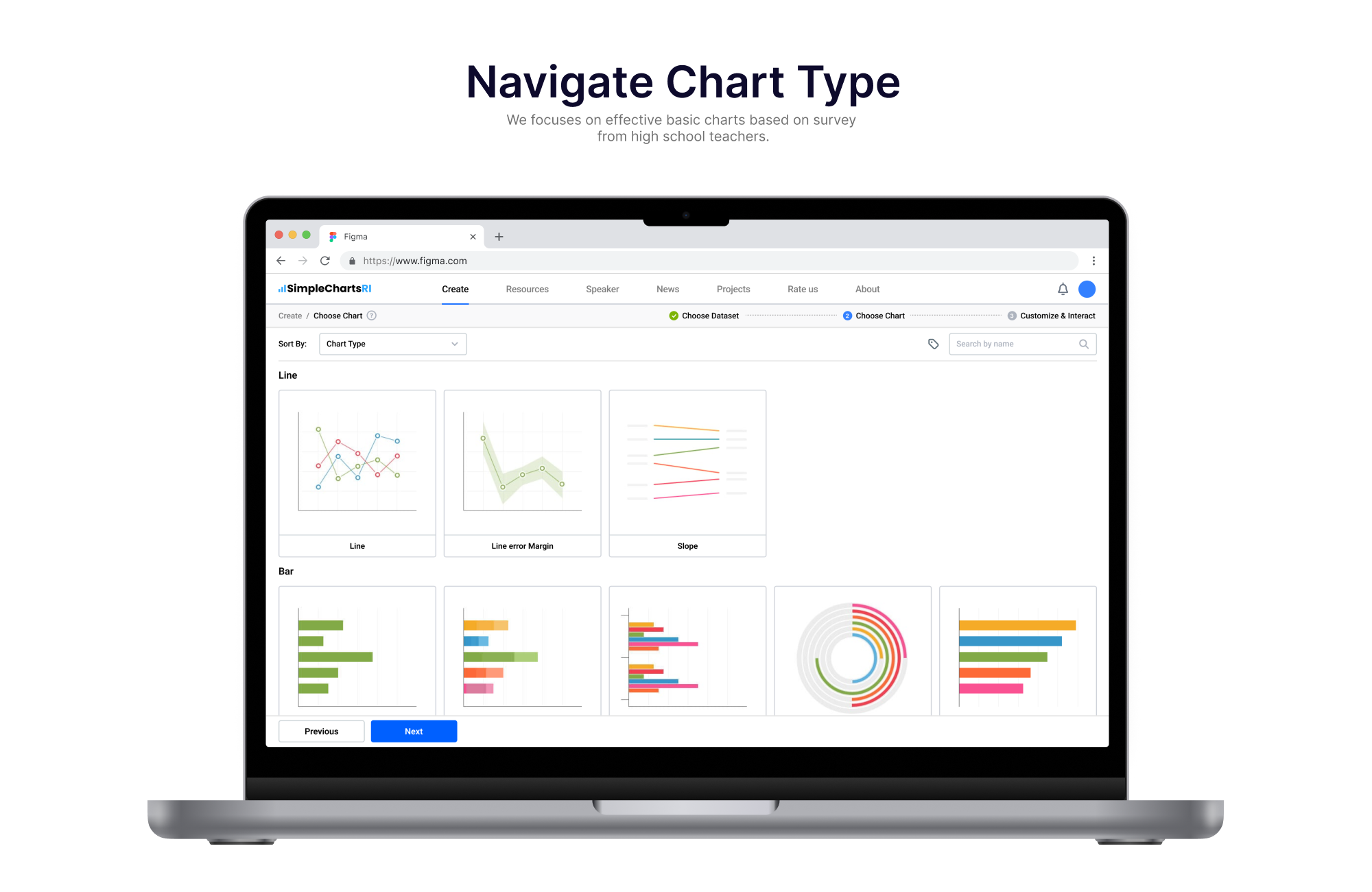
To enhance its functionality and usabilty, I worked with a multi-disciplinary team of researchers, designers and programmers to conduct a UX redesign. Plus a more intuitive user flow, clearer information hierarchy and consistent visual system, we added new features including: User Login system, “Save Chart to Cloud” Option and “Help” Tab. Additionally, Teacher and Student specific website experiences were created.
Role
UX Designer & Front-end Developer
Timeline
May 2022 - July 2022
Team
Shun Huang (UX and Visual Designer)
Sally Hamouda (Reserach Mentor, Data Scientist)
Anabela Maia (Reserach Mentor, Biologist)
Sean Khang (Developer)
Nate Erickson (Developer)
Molida Chan (Research Assistant)
Website


Research
We looked at recent research and studies about data science and data visualization educations in high schools.
Given that 40% of students are visual learners, visualizations are crucial for students retention. They allow students to make sense of complex data that would otherwise be difficult to understand. With current instruction mostly coming in the form of auditory and textual learning—written and spoken word—students who are visual learners underperform.
While visualization tools offer unique and effective methods of delivering information, they are not commonly used due to low practicality. If a teacher is interested in a visualization tool and wants to utilize it to, for instance, create a chart, they must first learn the tool, then find a good dataset that is suitable for their lesson and will likely be intriguing to their students, and then finally find a way to incorporate that visualization into their lesson plan. For something as simple as adding a single chart into their lesson, the time-cost associated with this process makes it unlikely for a teacher to utilize a visualization tool.

Survey responses in previous research
Alongside the learning previous research conducted by scholars and designers, we alsowe sent our own survey to Rhode Island high-school teachers. This survey was sent to teachers interested in attending a Data Visualization workshop.
![]()
![]()
Teacher Responses

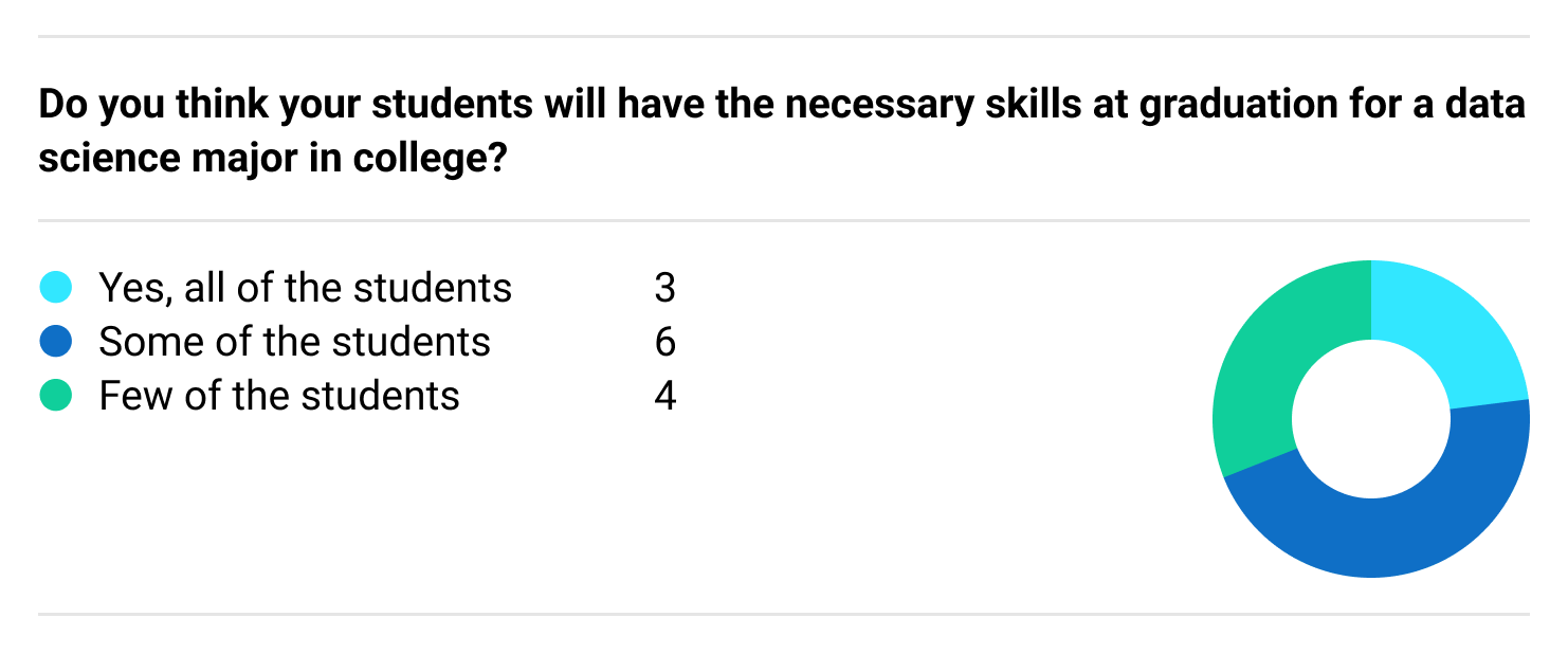
Teacher Responses
We also look at current data visualiztion tools.
Related Works
EduClust is an online application for teaching clustering algorithms that supports both real time teaching and learning in the classroom. The design was based on cognitive processes of active learning for the students to apply the algorithms, analyze them, evaluate, and then create their own. It has 15 pre-loaded examples of different as well as a create mode for users to import their own JSON file.
SimpleChartsRI
We took a similar approach by having real time pre-loaded data that teachers can use on the go in the classroom and students can use as inspiration to create their own data. Our data also focuses on proximity techniques primarily to Rhode Island.
CORGIS is a free, open-sourced web-based tool created at Virginia Tech to enable CS professors to use it as a teaching tool to teach non-CS majors data science. This tool contains over 40 real-time datasets that have been cleaned up and simplified for beginners. The visualizations created through the pre-loaded data can be interacted with but to an extent.
We add more interaction, such as highlighting or zooming the teaching capabilities of focusing on or hiding specific data.
Visualization Resources is a web-based catalog for open-source resources for data visualization such as tools, survey papers, literature, and other websites. It is aimed at students, practitioners, and researchers. This web catalog was created to reduce the need to blindly search for data visualization resources.
SimpleChartsRI is similar as we have a resource tab that includes slides on our workshop, activity books for teachers and students, auto-graded activities, and teacher-created activities. Our tool is more focused on data visualization, but we too want to give resources to our users, especially teachers and students.
Many Eyes is a public web-based tool for uploading data and creating interactive visualizations. Its focus is on its powerful data analysis capabilities and accessibility to users who don’t have much experience with visualizations. This tool also allows for communication amongst the community of users as well. With a registration requirement, users can comment on other visualizations and have discussions or link other resources.
Having this feature and having the accounts as a requirement is geared more towards older and single users and isn’t a tool that would allow quick simple access in the classroom.